Most websites look nice.
Very few work.
And before you go dumping $10k into another redesign that leads nowhere, do me a favor. Run this 5-minute gut check.
If your site flunks more than two? We need to talk.
1. Can I tell what you do in under 5 seconds?
Go to your homepage. Count to five.
If I still don’t know what you do, who it’s for, or why I should care? Your brand’s in trouble.
Clever taglines aren’t enough. I need clarity. Specificity. A reason to stay.
Good:
Helping founders turn ideas into unforgettable brands.
Bad:
Empowering authentic journeys toward transformation.
I’m already asleep.
2. Does your homepage make me want to scroll… or bounce?
Pretty isn’t the goal. Engagement is.
A high-functioning homepage pulls me through like a magnet. It should:
- Answer my top 3 questions fast
- Show me what makes you different
- Prove you know what you’re doing
- And give me something worth clicking next
If I have to work for it, I’m gone.
3. Is your voice distinct or default?
Here’s a secret: most sites fail not because of design, but because the copy is generic.
It sounds like everyone else in your industry. Safe. Sanitized. Scared.
You don’t need to be loud. But you do need to sound like a real human who knows what they’re doing.
Examples:
- Do you speak to me directly?
- Do you have a point of view?
- Can I hear your confidence through the screen?
Or does it feel like AI wrote the entire thing while eating a beige protein bar?
4. Is it obvious what you want me to do next?
You’d be shocked how many websites fail this one.
There’s no CTA.
There’s twelve CTAs.
There’s a button that says “Get Started” but doesn’t tell me what’s actually going to happen.
You need one clear, desirable action per page.
Not ten. Not "contact us" buried in the footer. Not a free consult hidden behind three scrolls and a pop-up.
If your user has to think? They won’t.
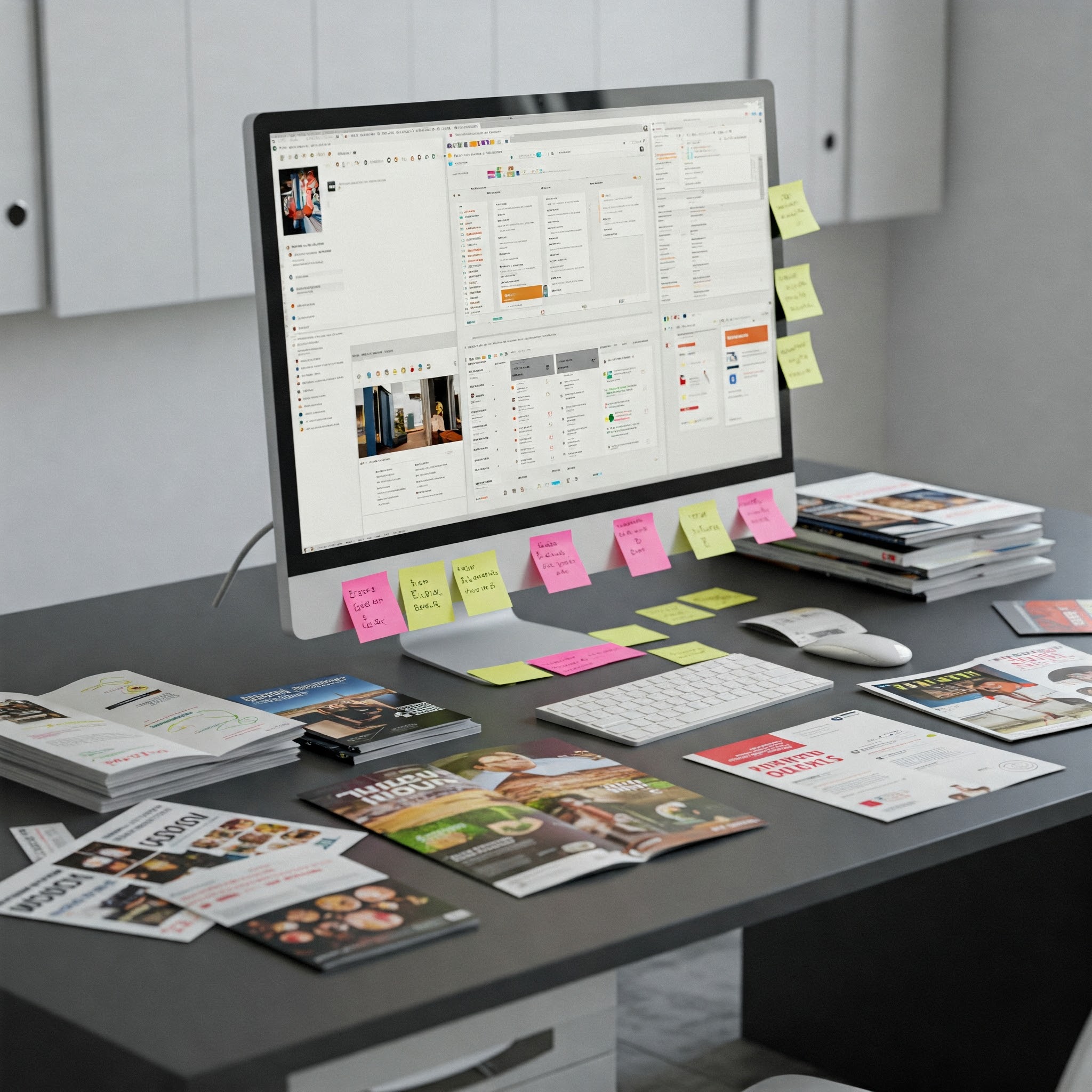
5. Are your images helping or hurting you?
Low-res stock photos? Insta screenshots from 2020? Group team pics that scream "awkward off-site energy"?
Throw them out.
Every visual on your site should:
- Reinforce your brand positioning
- Feel current
- Add clarity, not clutter
And if you're using AI images? Great. Make them look expensive, intentional, and brand-aligned.
6. Are you optimizing for mobile or just hoping it works?
More than half of your users will hit your site from their phone.
If the fonts are microscopic, the buttons overlap, or the layout collapses—you’ve just lost the sale.
And no, your Squarespace template isn't "probably fine."
Check it. Fix it.
7. Is it fast?
Speed is conversion.
If your site takes more than 3 seconds to load? I'm out.
Google's out.
Your clients are definitely out.
Compress your images. Streamline your code. Cut the plugins. No excuses.
8. Do I know why you and not someone else?
Every market is saturated. You aren’t the only one doing what you do.
What sets you apart isn’t just your services—it's your story, your tone, your precision.
Do you:
- Name your method?
- Show a clear framework?
- Share client wins?
- Use testimonials that sound like real people?
Don’t be the best-kept secret. Be the brand people remember.
TL;DR: The Gut Test Recap
- Can I tell what you do in 5 seconds?
- Does the homepage pull me through?
- Is your voice distinct?
- Is the next action clear?
- Are your visuals strong?
- Is it mobile-first?
- Does it load fast?
- Do I know why you?
Flunked more than two? Then yes, your website is wasting time.
But the good news?
You just found the person who can fix it.
Book a discovery call.
Let's make your brand unforgettable.